Chapter 6: Settings Menu
Now that we have set up our Pause Menu (in the previous chapter), we can start adding the different menus inside. The first one that we’ll create is the Settings Menu.
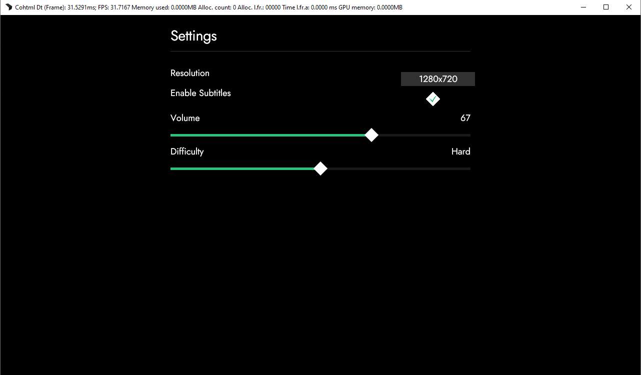
For the purpose of this tutorial we’ll add only a handful of options to the Settings. These will be: Volume, Resolution, Difficulty and Subtitles. While these may seem like they are not enough for a Settings Menu, the idea is to only demonstrate how it can be achieved.
In order to create our options we’ll need to use a slider, dropdown and checkbox inputs. Currently, Gameface only supports text input - this is why we have also created a components library that enables users to easily use custom components (such as those mentioned above and more).
Installing the Gameface components
We’ll start by downloading the components library. To get it you need to use a package manager like npm. You can check the components repository via the following link.
The components that we’ll be using will be the checkbox, dropdown and range slider. To install them we simply need to run the following commands one by one:
npm install coherent-gameface-components
npm install coherent-gameface-checkbox
npm install coherent-gameface-dropdown
npm install coherent-gameface-rangeslider
Adding the Gameface components to your project
Adding the dependencies
Now we can include them in our project. To do that we need to add their respective script, style files and coherent-components script. Each component’s script is located inside the umd folder and follows the naming convention: <component_name>.production.min.js. The components script is found in /umd/components.production.min. To include all of the scripts we’ll add the following code to the bottom of our index.html body after the other scripts:
<script src="./node_modules/coherent-gameface-components/dist/components.production.min.js"></script>
<script src="./node_modules/coherent-gameface-checkbox/dist/checkbox.production.min.js"></script>
<script src="./node_modules/coherent-gameface-dropdown/dist/dropdown.production.min.js"></script>
<script src="./node_modules/coherent-gameface-rangeslider/dist/rangeslider.production.min.js"></script>
After the scripts, we need to add the styles as well. These are the default styles of the elements, some of which will be overridden by the style.css we already have in place. To add the styles we need to add the following code in the head tag of our index.html (above the style.css) like this:
<link rel="stylesheet" href="./node_modules/coherent-gameface-checkbox/style.css">
<link rel="stylesheet" href="./node_modules/coherent-gameface-dropdown/style.css">
<link rel="stylesheet" href="./node_modules/coherent-gameface-rangeslider/styles/horizontal.css">
<link rel="stylesheet" href="./style.css">
Adding the componets to your html
And now we can start making our Settings Menu. We’ll begin by adding the .settings-menu container:
<div class="pause-menu" data-bind-if="{{PlayerModel.isPaused}}">
        <div class="settings-menu"></div>
</div>
Inside, we’ll add a .settings-heading element:
<div class="settings-heading">Settings</div>
We can now start adding our custom components. To do that for each option in our menu we’ll wrap them with a .settings-option-row or .settings-option-column wrapper. This will allow us to position labels to those components.
Dropdown
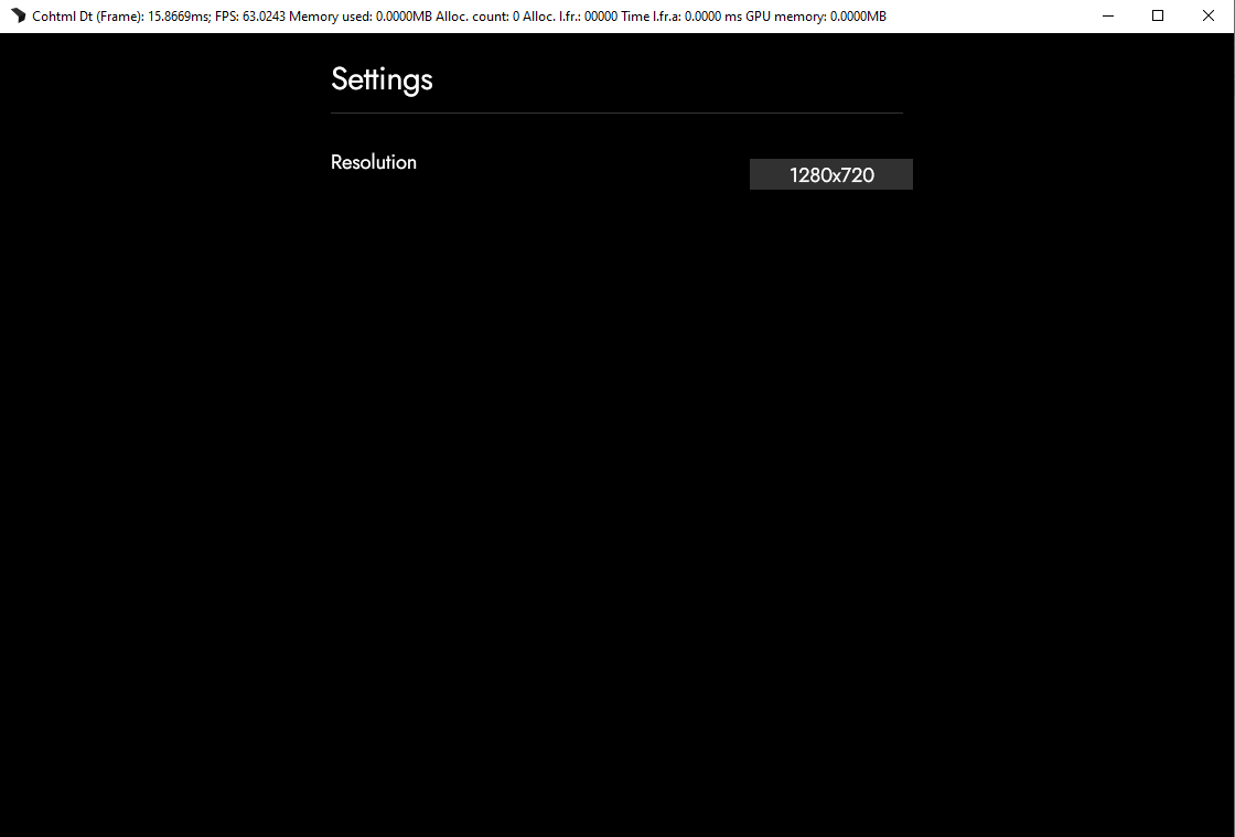
First we’ll add a resolution dropdown. To achieve this, we’ll add a .settings-option-row wrapper and inside we can add the Resolution label and the component. To use the component we only have to add the <gameface-dropdown></gameface-dropdown> element and add <dropdown-option slot="option"></dropdown-option> tags inside for the options. The options for the resolutions are 1280x720, 1366x768, 1440x900, 1920x1080, 2560x1440 and 3840x2160. If we have done everything correctly our code should look something like this:
<div class="settings-option-row">
   <div>Resolution</div>
   <gameface-dropdown class="dropdown">
       <dropdown-option slot="option">1280x720</dropdown-option>
       <dropdown-option slot="option">1366x768</dropdown-option>
       <dropdown-option slot="option">1440x900</dropdown-option>
       <dropdown-option slot="option">1920x1080</dropdown-option>
       <dropdown-option slot="option">2560x1440</dropdown-option>
       <dropdown-option slot="option">3840x2160</dropdown-option>
   </gameface-dropdown>
</div>
And in the Player:
Checkbox
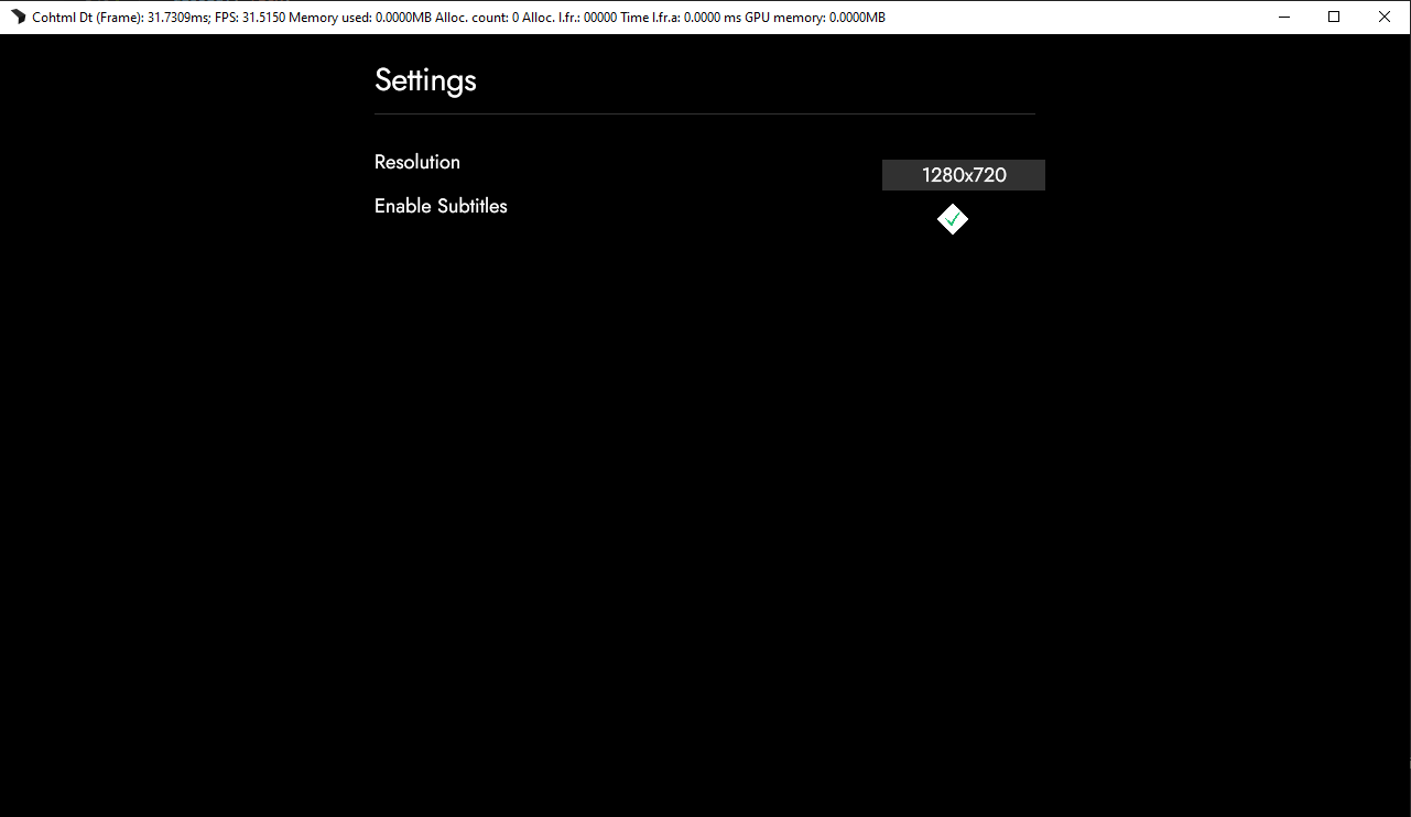
Up next is the show subtitles checkbox. We’ll add another .settings-option-row div and inside we’ll add the label ‘Enable Subtitles’ again in a div and the checkbox component. To add the component, you simply need to add the <gameface-checkbox></gameface-checkbox> element to the index.html. Inside this element you can add two slots with the <gameface-checkbox></gameface-checkbox> element -
- We’ll add only a single one for the checkbox background, which is the checkmark:
<component-slot data-name="checkbox-background"></component-slot>
We’ll then add it and then put inside - a div with a class .checkbox-background
<gameface-checkbox class="checkbox-component">
    <component-slot data-name="checkbox-background">
        <div class="guic-checkbox-background"></div>
    </component-slot>
</gameface-checkbox>
In the end the code should look like this:
<div class="settings-option-row">
    <div>Enable Subtitles</div>
    <gameface-checkbox class="checkbox-component">
        <component-slot data-name="checkbox-background">
            <div class="guic-checkbox-background"></div>
        </component-slot>
    </gameface-checkbox>
</div>
The checkbox-background has already been set in our style.css, so if we open the Player we’ll see the following:
Range slider
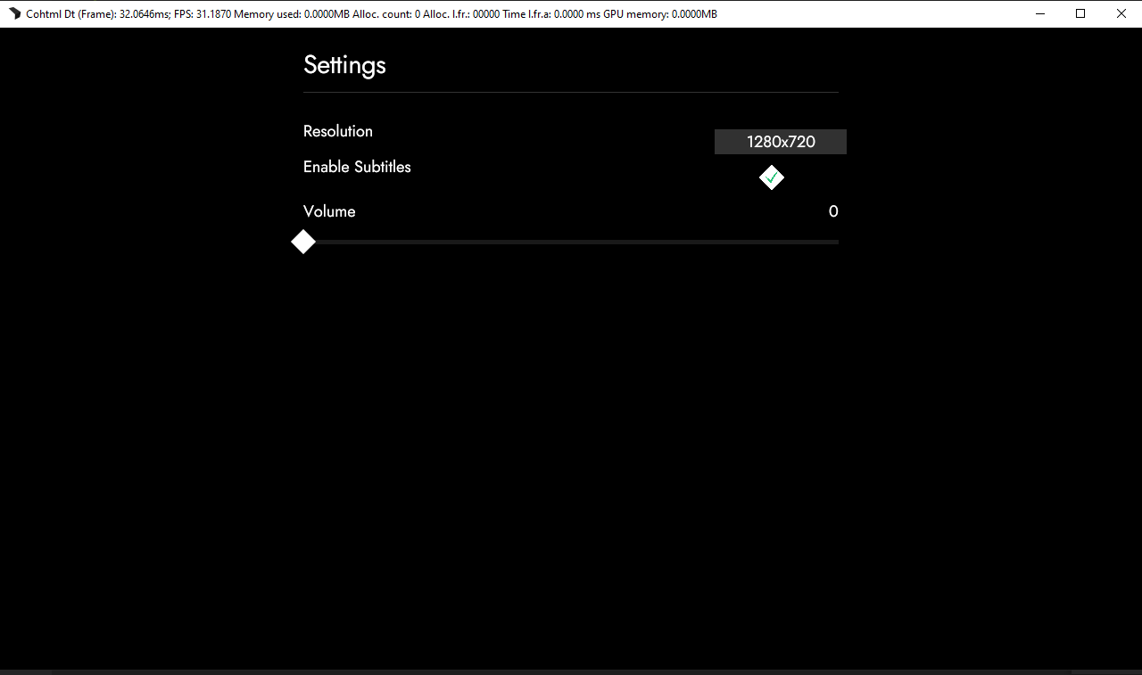
For our final options we’ll be using the range slider component. We’ll firstly use it as a way to control the volume of the game, and then to choose the difficulty level. To do this we’ll need to create a .settings-option-column container; inside we’ll add another .settings-option-row. Inside it, we’ll add a label just like in the previous examples - ‘Volume’ and a new container .volume-value that will display the value of the slider inside.
<div class="settings-option-column">
    <div class="settings-option-row">
        <div>Volume</div>
        <div class="volume-value">0</div>
    </div>
</div>
Now inside the .settings-options-column we can add our range slider so it can be positioned below the label and value
<div class="settings-option-column">
    <div class="settings-option-row">
        <div>Volume</div>
        <div class="volume-value">0</div>
    </div>
    <gameface-rangeslider class="slider-volume"></gameface-rangeslider>
</div>
If we open the index.html in the Player we’ll see:
However, if we move the slider handle, the value for the volume won’t change. To change it, we need to go to our script.js file and add the following code inside the engine.on(“pause_toggle”) callback:
const sliderVolume = document.querySelector(".slider-volume");
const volumeValue = document.querySelector(".volume-value");

sliderVolume.addEventListener("sliderupdate", (e) => {
    volumeValue.textContent = e.detail;
});
Here we are getting both the slider and the volume-value wrapper that we created earlier and we are attaching the sliderupdate custom event to our slider. This event fires whenever we move the handle of the slider.
The reason why we are putting the code in the ‘pause_toggle’ event is because we are using data-bind-if and when we refresh the Player, the components are not present.
Now if we move the handle in our pause menu, we can see that the volume value gets updated.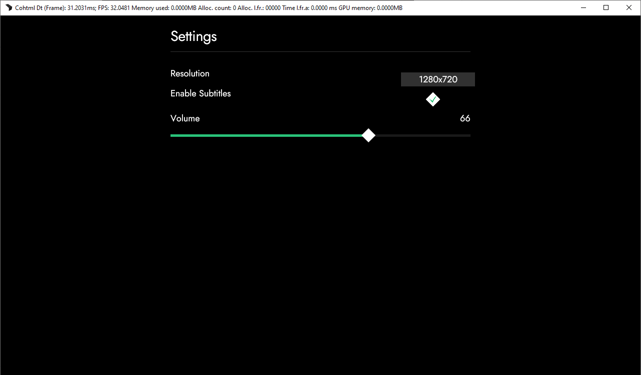
The last option we need to add is the difficulty setting. To do that we’ll use the range slider again and to save some time, we’ll just copy the code from the previous option. And now we can change the following things: Volume to Difficulty, volume-value to difficulty-value and slider-volume to slider-difficulty.
<div class="settings-option-column">
   <div class="settings-option-row">
      <div>Difficulty</div>
      <div class="difficulty-value">0</div>
   </div>
   <gameface-rangeslider class="slider-difficulty"></gameface-rangeslider>
</div>
It’s important to note that this won’t allow us to change the difficulty of our game, unless we want it to be between 0 and 100. To add some values, we’ll need to use one of the attributes of the range slider - values. With values we can add an array of values that will be rendered by the range slider. We’ll add the following difficulties: “Easy”, “Normal”, “Hard”, “Expert” and “Nightmare” by adding the following code to our range slider:
<gameface-rangeslider values='["Easy", "Normal", "Hard", "Expert", "Nightmare"]' class="slider-difficulty"></gameface-rangeslider>
If we now reload the Player, we will see that handle moves only to 5 spaces, which correspond to our difficulty settings. With that we can copy over our code in the ‘pause_toggle’ callback and change it appropriately:
const sliderDifficulty = document.querySelector(".slider-difficulty");
const difficultyValue = document.querySelector(".difficulty-value");

sliderDifficulty.addEventListener("sliderupdate", (e) => {
   difficultyValue.textContent = e.detail;
});
if (PlayerModel.isPaused) {
   const sliderVolume = document.querySelector(".slider-volume");
   const volumeValue = document.querySelector(".volume-value");

   sliderVolume.addEventListener("sliderupdate", (e) => {
       volumeValue.textContent = e.detail;
   });

   const sliderDifficulty = document.querySelector(".slider-difficulty");
   const difficultyValue = document.querySelector(".difficulty-value");

   sliderDifficulty.addEventListener("sliderupdate", (e) => {
       difficultyValue.textContent = e.detail;
   });
}
And with that we are done with our Settings Menu.
For the next chapter we’ll see how to add other pages to our pause menu.
Get the chapter files
You can download the completed chapter from here